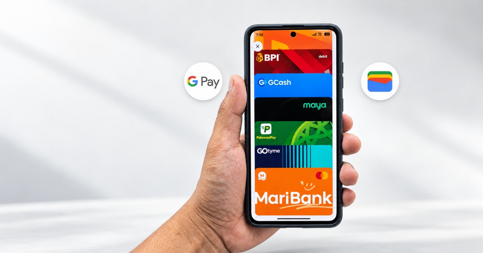
Google Wallet is rolling out a redesigned payment-card view on Android, replacing the familiar horizontal carousel with a vertically stacked interface. The change makes more saved cards visible at once after users expand the stack, while retaining a prominent view of the currently selected card.
A tap or downward swipe opens the stack into a full-screen card list. The expanded view includes a “Manage payment methods” option at the bottom, where users can reorder cards and select the default card for payments.
Choosing a card for contactless payment remains straightforward, but card details and transaction history have moved behind a new gear-shaped icon in the upper-right corner. That adds an extra step compared with the previous interface.

The layout may be easier to operate one-handed, particularly when frequently used cards are placed near the bottom of the list. The redesign began appearing in September and is now reaching more users through a server-side rollout, so installing a new version of the app may not be required.