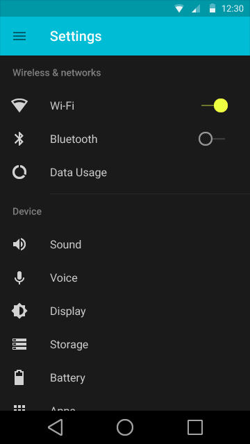
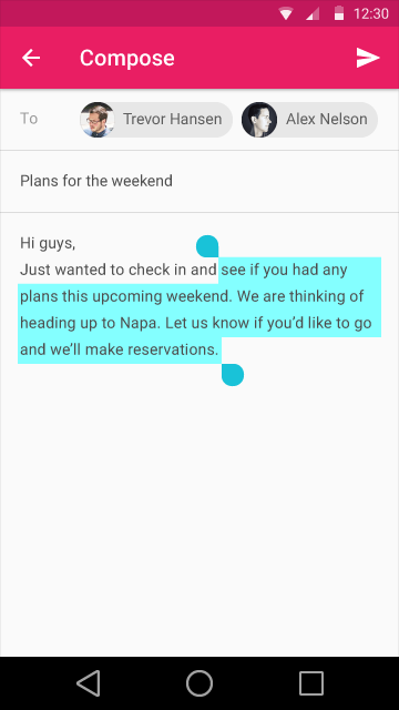
During today’s Google I/O 2014 event the big G teased some aspects of the upcoming Android release that still doesn’t have a name. It’s tentatively called “L-release” and thanks to a Reddit leak we have some shots of the OS to show you. Keep in mind we can’t guarantee these are the real deal, but they sure look like the images shown at I/O.
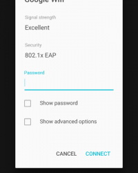
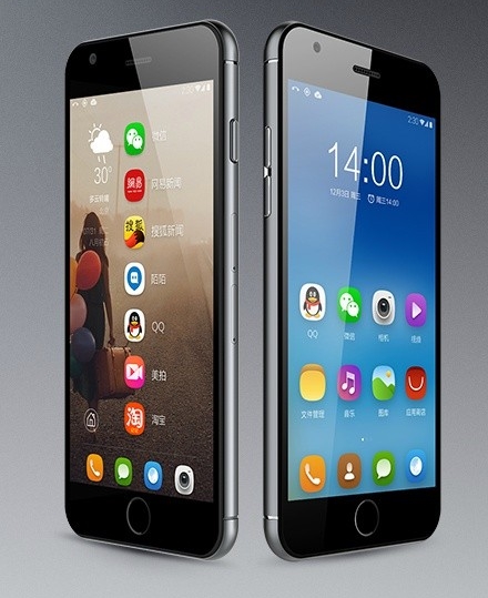
We get a flatter interface, with some bizarre color choices, that include a black background for the settings menu and bright green for some of the sliders in the menu. This new interface is built following the principles of the new Material Design. This means brighter colors, smoother animations and an unified look across all devices. L release has a flat look and sports rounder elements and softer edges.
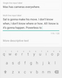
This look will also come to Chrome OS and Google’s web services. Shapes are simplified and Android buttons are now geometrical shapes: triangle, circle and square. I kind of dislike the hue they used for Gmail, since it’s not easy on the eyes at all. The black keyboard seems borrowed from HTC Sense, which is not exactly a bad thing. To me Google went even flatter than Apple with their iOS. Is that bad or good?
Via Reddit

