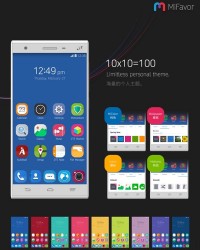
After Xiaomi, Meizu and Huawei, it’s ZTE’s turn to come out with a brand new UI for its Android devices. Following the other companies, this UI will be flat and minimalistic and it will also includ colors that don’t feel washed out, unlike other flat UIs.
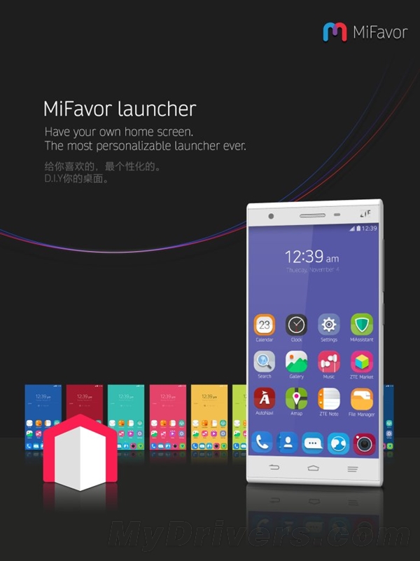
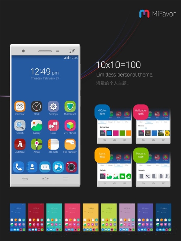
The new approach comes under the name MiFavor UI 3.0 and there are screenshots of it included in this article. All we have now is a beta package of the new release and the new system comes with a bunch of DIY features, like the ability to select your own icons for each app. The notification system is also slightly tweaked and it involves a special messaging folder of sorts. The notification area is a combo of gray, green and white that looks stylish and the icons are spot on, while being simplistic.
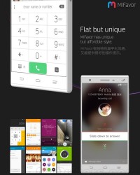
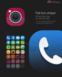
The color choice and messaging app make me think of LG for some reason, while the dialer is pretty iOS-like and so is the calling window. Mifavor allows you to edit the position and size of the dialer, comes with a powerful photo editing tool and a variety of features to tweak in the camera app (horizon, focus, metering, ISO, exposure, white balance, smile and beauty, among others).
This is merely beta stage, but sometime in early 2015, the software will be finalized, according to ZTE’s roadmap. In the meantime you can try out the new design by downloading a pack from here with the password e35b and from here another pack with the password 5988.