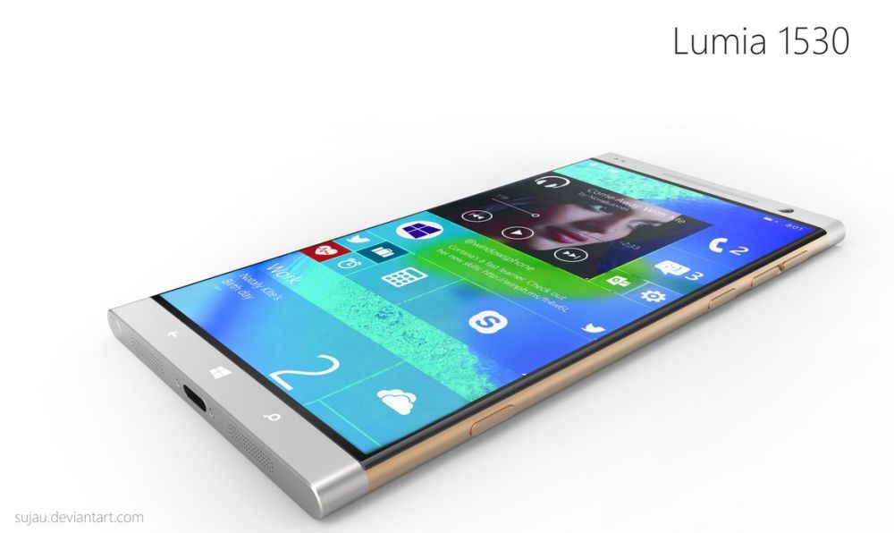
Engadget has done it again, managing to fully preview Windows Phone 7. Microsoft’s newest mobile product must be smashing, not only great, specially to clear the company’s broken image, due to the huge Kin failure. 2 years of development have brought us to what you can see in the following images.
From Engadget’s full and detailed preview we learn that the Metro UI is still present in WP7, together with its blocks of color and text. Depth and detail are well conveyed and the overall user experience is great, thanks to touch responsiveness and speed. The OS is based around three main areas: homepage tiles, an app list and the Hub pages.
The navigation is intuitive and based on the length of presses, able to unlock new features on the platform. A drop down Android-like windows shade will let you know there’s a new SMS available, which we certainly dig. As far as loading animations are concerned, they’re subtle but nice-looking, enough to let the user know there’s a CPU at work in there.
We must, however, put praise aside and criticise the lack of copy and paste, plus third party multitasking of apps. Back to the favourable side of the preview, the WP7 virtual keyboard is great. It’s almost as good as the iPhone one and certainly better than the one on Android, because it’s simple and clean.
The browser also suffers because of lack of Flash, Silverlight and HTML5 support, but these aren’t available in this version of the OS, so we’re curious to see IE Mobile in the finalized version. For now Engadget tells us that the browser is OK, but you can learn more about social networking in WP7, SMS, browsing, emails, Zune, camera and marketplace from the full preview here.
[via Engadget]


